#
UI Basics
#
Concept
The iLiv Composer™ and iLiv Performer™ user interfaces are, shall we say, somewhat unique.
They pack in a lot of information, and because of that, they look very different from the typical software UI we are all much accustomed to looking at.
Performer's mandate is to show each User a single page view of everything they have to do across all of their work. And since Performer is so good at managing many, often complex, usually long-term, work processes, it can add up to a lot of information.
When we designed Performer, we wanted to avoid endlessly taking the User off one page to look at another, leaving them confused about where they came from and to where their information has gone.
Humans have a highly developed sense of space. We came from the trees, and were born highly conscious of the dangerous effects of gravity -- we have strong intrinsic vertical awareness. When we came down from the trees to roam the plains, we had to develop a strong horizontal memory, in order to compensate for our lack of intrinsic horizontal awareness -- we have strong horizontal memory. Spatial memory is a powerful attribute all humans possess, and it is more highly developed in the horizontal plane than in the vertical.
In our apps, we take advantage of spatial memory by keeping the left-right order of things in our UI constant. Once you know that something is "over there", it will always be over there.
We also take advantage of our natural ability to navigate the vertical. Vertical scrolling is reserved for lists (with the most urgent stuff at the top), and for panels describing single items (with details of lesser importance lower down).
In summary, while Performer looks large and complex at first glance, you will learn very quickly where things are. That's because the layout never changes, and the page never goes away.
#
How it works
#
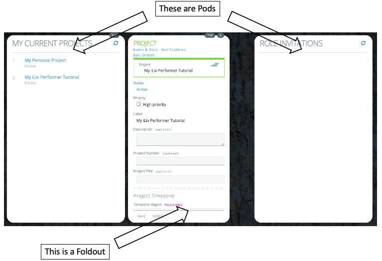
Pods
Performer has 5 Pods. Composer has 3. They are always visible.
Their order, titles, and widths never change.
Their height grows and shrinks with your browser window.
#
Foldouts
Foldouts are panels that appear to the right of a Pod when you ask to see an item's details or attachments.
The number of Foldouts beside each Pod can grow indefinitely. When you don't need them anymore, you close them. You can also easily close all of the foldouts for one Pod with one click on the close all icon at the upper right corner of the Pod.
#
Scrolling
The width of both Pods and Foldouts never changes. If the content does not fit vertically, vertical scrollbars appear. If it doesn't fit horizontally, the content wraps.
#
The Map
Horizontally scrolling never happens inside a Pod, but the total width of all the Pods and open Foldouts is usually wider than your screen. So you often scroll the whole single Pods+Foldouts page horizontally, as a unit.

At the very bottom of the UI is a little numbered map that shows you what part of the total width of all Pods and Foldouts is visible on your screen at that moment. It also allows you to jump sideways to any Pod by clicking on its number.
#
The static top
There is a band at the very top of the UI that never moves or goes away. There you can set your current timezone, log-out, etc.